Something about Her

Visual Identity & branding

Who They Are

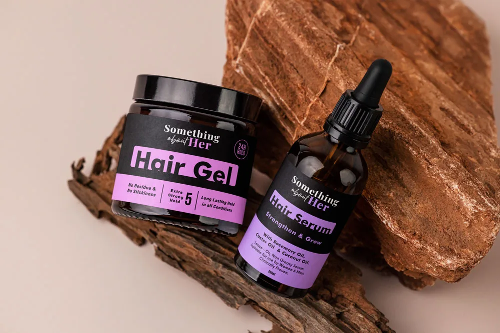
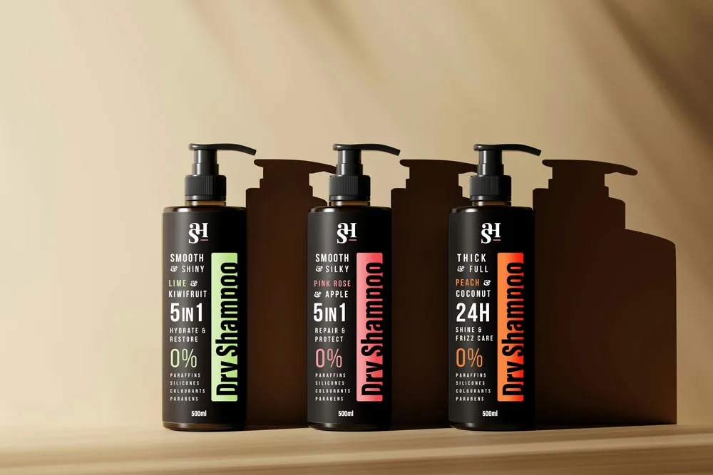
Something About Her was established in 2023 in Perth, Western Australia, and is dedicated to providing high quality hair extensions and hair products. They ensure that every customer receives the best product for their hair type and needs, along with expert advice to help them look and feel their best.

They pride themselves on creating a welcoming and supportive environment where every customer can express their unique style and feel confident doing so.

Brief

To develop a high end visual identity for a premium hair extension brand. The goal is to establish a market position that resonates with an affluent, style conscious demographic (ages 18–35) by balancing editorial sophistication with a modern, approachable edge.

Design Concept

This visual identity for Something About Her was crafted to evoke the feeling of a high-end boutique experience. Because hair extensions are about enhancing one's natural beauty and confidence, the design focuses on "elevation" and "effortless style.

Monogram

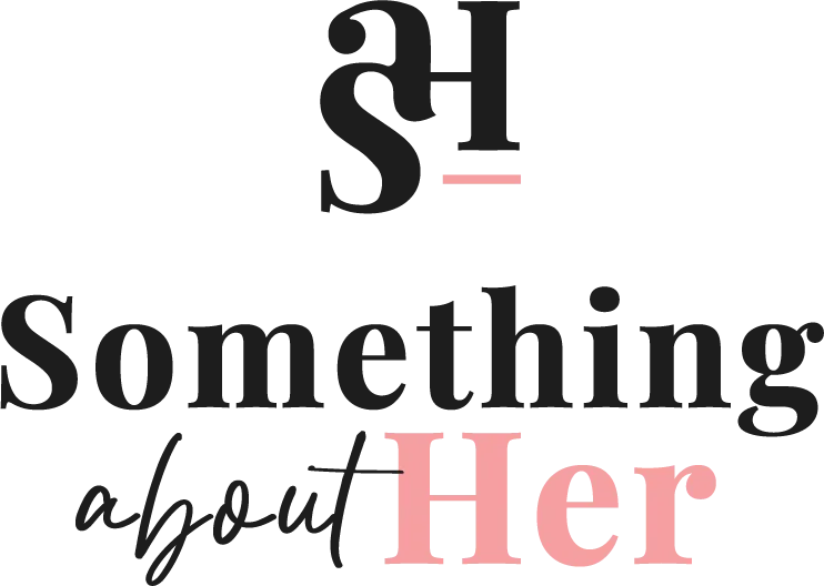
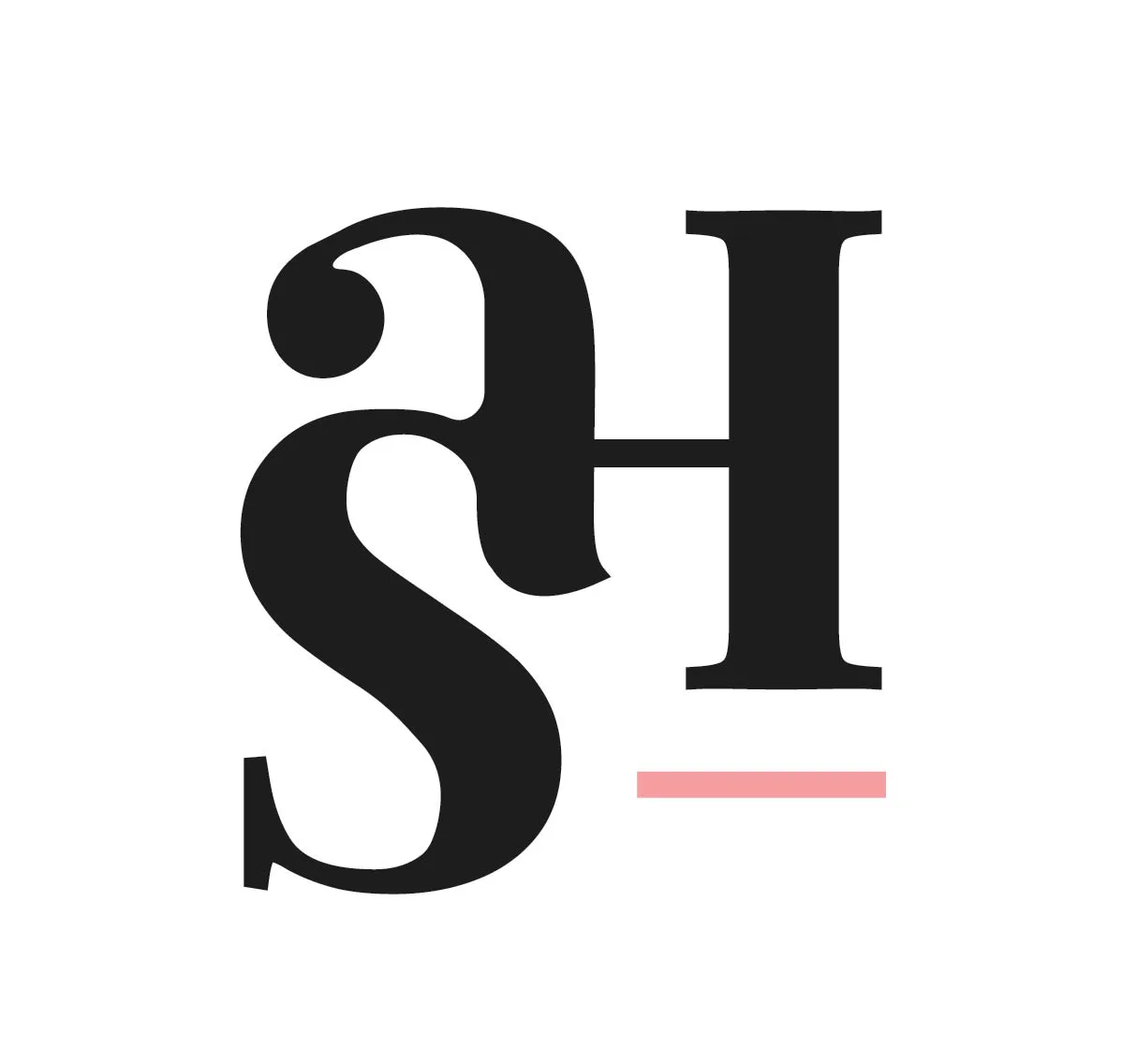
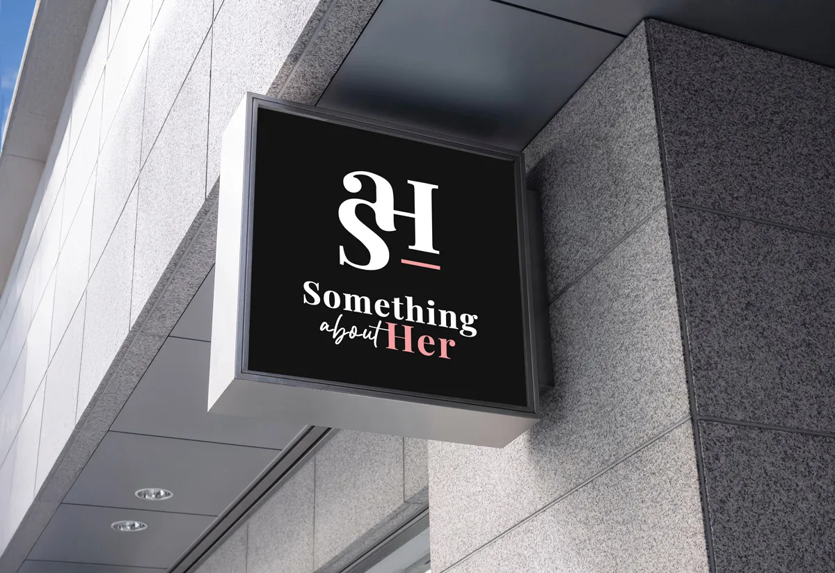
Forming the icon at the top, I wanted a custom-lettered monogram combining the S, A, and H.

The Connection Between Typography and Beauty

The SAH monogram is built on the idea that every letter in a typeface is unique and exceptionally crafted. Just as every person has their own distinct style, each letter is designed to be defined and cherished for its own individual beauty. By bringing these different letterforms together into a monogram, we are taking the best elements of each to create something entirely new. This process doesn't change the original characters; instead, it emphasises and accentuates the beauty that was already there. This reflects the purpose of hair extensions - seamlessly integrating with a person's natural hair to enhance and celebrate their own natural beauty.

The Foundation

Positioned under the 'H,' a horizontal pink accent acts as a foundation line, symbolising the structural support and quality of the extensions.

S
+
a
+
H
=

#F69EA1

#F8F8F9
#333132

Colour Palette

Black & White
This high contrast pairing provides a timeless, "little black dress" feel. It ensures the logo remains legible across various packaging materials and social media platforms.
Pastel Pink
The pop of soft pink adds a necessary layer of warmth and femininity without feeling juvenile. It softens the boldness of the black background, making the brand feel approachable yet elite.

Typography

With this logo it utilizes a mix of two distinct typographic styles to represent the diverse nature of the brand:
Serif - Something
We chose a bold, high-contrast serif font that mirrors the aesthetic of luxury fashion magazines (like Vogue or Harper’s Bazaar). This establishes immediate authority and premium quality.
Script - About
Script type can represent personal empowerment, highlighting that every extension application is a unique, custom journey tailored specifically to the individual. It suggests that the beauty and control of the final look belong entirely to the customer.
Serif - Her
By making "Her" the focal point in a clean, bold serif font, we shift the emphasis to the customer. It celebrates the individual woman and the confidence she feels.
Strings
abcdefghijklm
nopqrstuvwxyz
1234567890
PlayFair Display
abcdefghijklm
nopqrstuvwxyz
1234567890
Three black shampoo bottles stand on a shelf, showcasing the typographical packaging design elements on the bottles.
Here @Altitude Creative Studio our heads are always in the clouds, but we're down to earth. We're here to bring a new atmosphere of design. We're a small and enthusiastic studio based in Perth, Western Australia full of great ideas and passion.

Let's Get Started!

Please fill out the short form so we can assist you in starting your desired project!
1
2
3
4
5
Design Options*